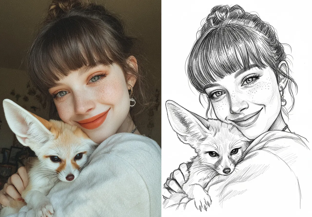
Cómo preparar un retrato grabado con láser perfecto
Si tus retratos grabados con láser salen demasiado oscuros, pierden detalle o se ven quemados, el problema normalmente no es tu máquina.
Es la preparación de la imagen.
El grabado láser es extremadamente sensible al contraste y a la estructura tonal. Entender esta diferencia es la clave para obtener resultados limpios y profesionales.
Por qué fallan la mayoría de los retratos en el grabado láser
El grabado láser no se comporta como la impresión.
En lugar de depositar tinta, el láser quema el material. Esto significa que no puede interpretar las transiciones suaves como lo hacen las pantallas o las impresoras.
La mayoría de las fotos contienen:
sombras suaves
bajo contraste
demasiados tonos medios
Son agradables a la vista en pantalla, pero problemáticas para el grabado.
Los sistemas láser necesitan una separación clara entre zonas claras y oscuras. Cuando dominan los tonos medios, el resultado queda sucio o sobrequemado.
Cómo se ve un buen retrato grabado con láser
Una imagen bien preparada para grabado tiene tres características esenciales:
1. Contraste fuerte
Separación clara entre luces y sombras.
2. Estructura facial definida
Los ojos, la nariz y la boca deben leerse de un vistazo.
3. Distribución controlada del detalle
Las zonas importantes llevan el detalle. Las menos importantes se mantienen simplificadas.
En la práctica:
las luces deben permanecer abiertas y limpias
las sombras deben ser profundas pero controladas
los tonos medios deben reducirse, no conservarse
Pencil Sketch frente a otros métodos
Hay varios métodos habituales para preparar imágenes para el grabado:
umbral (blanco y negro puros)
tramado (patrones de puntos)
detección de bordes
conversiones basadas en boceto
Cada uno tiene sus compromisos.
Los métodos de umbral son simples, pero a menudo pierden el detalle facial.
El tramado puede conservar los tonos, pero puede introducir ruido e inconsistencias.
Los enfoques basados en boceto, especialmente las conversiones estilo lápiz, suelen funcionar mejor para retratos porque traducen la información tonal en un trazo estructurado en lugar de puntos aleatorios.
Por qué funciona tan bien el estilo Pencil Sketch
El estilo Pencil Sketch transforma una foto en trazos direccionales.
En lugar de píxeles, la imagen se construye a partir de:
un flujo de líneas limpio
sombreado intencional
detalle estructurado
Esto imita la forma natural en que los artistas dibujan rostros, lo que encaja muy bien con la manera en que el grabado láser interpreta el contraste.
El resultado suele ser:
una legibilidad facial más clara
un comportamiento de grabado más predecible
menos quemado no deseado en las zonas oscuras
Cuándo el Pencil Sketch puede no ser ideal
El estilo lápiz es muy eficaz, pero no universal.
Puede tener dificultades con:
imágenes de muy baja resolución
retratos extremadamente oscuros o subexpuestos
imágenes con sombras densas que cubren el rostro
En estos casos, se requiere un preprocesamiento (corrección de exposición y contraste) antes de la conversión.
El papel del procesamiento avanzado (Pro Mode)
Los modos de procesamiento avanzado, como el Pro Mode de VectorWitch, ayudan a refinar la imagen antes del grabado.
Estos sistemas suelen mejorar:
la claridad de los bordes
la reducción de ruido
la priorización del detalle
El objetivo no es añadir detalle, sino eliminar la información innecesaria y conservar lo que importa.
La variable más importante: el contraste
El contraste es el factor más importante en la calidad del grabado.
Un contraste adecuado:
separa el sujeto del fondo
define con claridad los rasgos faciales
evita que las grandes zonas oscuras se sobrequemen
Una buena imagen para grabado suele verse ligeramente "sobrecontrastada" en pantalla.
Eso es lo esperado.
Como el grabado comprime el rango tonal, lo que se ve fuerte en digital a menudo se traslada correctamente al material.
Ajustes recomendados para los mejores resultados
Aunque los ajustes varían según la máquina y el material, estas pautas son fiables:
Usa una entrada de alta resolución (al menos 300 DPI)
Aumenta el contraste hasta que los rasgos faciales destaquen con claridad
Evita grandes fondos negros sólidos
Mantén las luces abiertas (no las rellenes de gris)
Simplifica los tonos medios en lugar de conservarlos
Previsualiza siempre antes de grabar.
Flujo de trabajo práctico (con VectorWitch)
Crear un retrato grabado con láser limpio con VectorWitch está pensado para ser sencillo.
A diferencia de los flujos tradicionales, la mayor parte de la complejidad se gestiona automáticamente.
1. Sube tu retrato
Comienza subiendo una imagen clara y de alta calidad.
Una mejor entrada sigue mejorando los resultados, especialmente en la claridad facial.
2. Selecciona el estilo Pencil Sketch
Elige Pencil Sketch para obtener los resultados de grabado más fiables.
Este estilo convierte la imagen en un trazo estructurado que funciona muy bien con el grabado láser.
3. Haz clic en Generate
Haz clic en Generate.
VectorWitch automáticamente:
optimiza el contraste
simplifica los tonos medios
estructura los detalles para el grabado
No se requiere ningún ajuste manual.
4. (Opcional) Activa el Pro Mode
Para resultados más refinados, activa el Pro Mode.
Esto mejora:
la claridad de los bordes
la reducción de ruido
la priorización del detalle
Úsalo cuando quieras una salida más pulida y profesional.
5. Revisa el resultado
Comprueba la imagen generada:
los rasgos faciales deben leerse con claridad
las luces deben permanecer limpias
las zonas oscuras no deben sentirse demasiado pesadas
Si es necesario, vuelve a generar o prueba pequeñas variaciones.
6. Descarga en calidad 4K
Cuando estés satisfecho, descarga el resultado en alta resolución (4K).
La imagen queda lista para grabar sin procesamiento adicional.
Principio clave
El objetivo no es ajustar manualmente cada detalle.
Es partir de una buena imagen y dejar que el sistema la traduzca en una estructura lista para grabado.
Con el estilo correcto, el proceso se vuelve rápido, predecible y consistente.
Reflexión final
Un retrato grabado con láser exitoso no se crea en la máquina.
Se crea durante la preparación de la imagen.
Con la estructura correcta, tu grabado se vuelve predecible y limpio.
Con la imagen equivocada, ni siquiera los ajustes de máquina perfectos pueden arreglar el resultado.
Herramientas como VectorWitch están diseñadas para simplificar este proceso de preparación, pero el principio de fondo sigue siendo el mismo:
El grabado no consiste en preservar la imagen.
Consiste en traducirla en contraste y estructura.